My House
My Rights
My Rights
Creating a website that uses storytelling to help immigrant families of Atlanta understand and exercise their rights as tenants. In partnership with the Atlanta city government
Creating a website that uses storytelling to help immigrant families of Atlanta understand and exercise their rights as tenants. In partnership with the Atlanta city government
Overview
Result
A mobile-first, educative
website built in Gatsby
website built in Gatsby
My role
Full stack web developer
The team
Hannan Abdi
Tools
React, Gatsby, Figma
Timeline
Dec 2020 - May 2021 (ongoing)

Client
Welcoming Atlanta provides direct service work to immigrants in Atlanta, offering personal guidance and support, running food drives, connecting residents with legal and victims counseling, among a host of other assistance measures. Their constituency is largely Latinx, low-income folks who may or may not be documented.
Problem
While the NoMasDeslojos.com site we built (see project) was successful in helping Welcoming Atlanta’s constituents file the CDC moratorium on evictions and stay in their homes, we knew that this was a last resort — and far from the ideal.
So, how do we support tenants in avoiding an eviction order in the first place, and to feel confident in knowing and exercising their rights?
So, how do we support tenants in avoiding an eviction order in the first place, and to feel confident in knowing and exercising their rights?
Solution
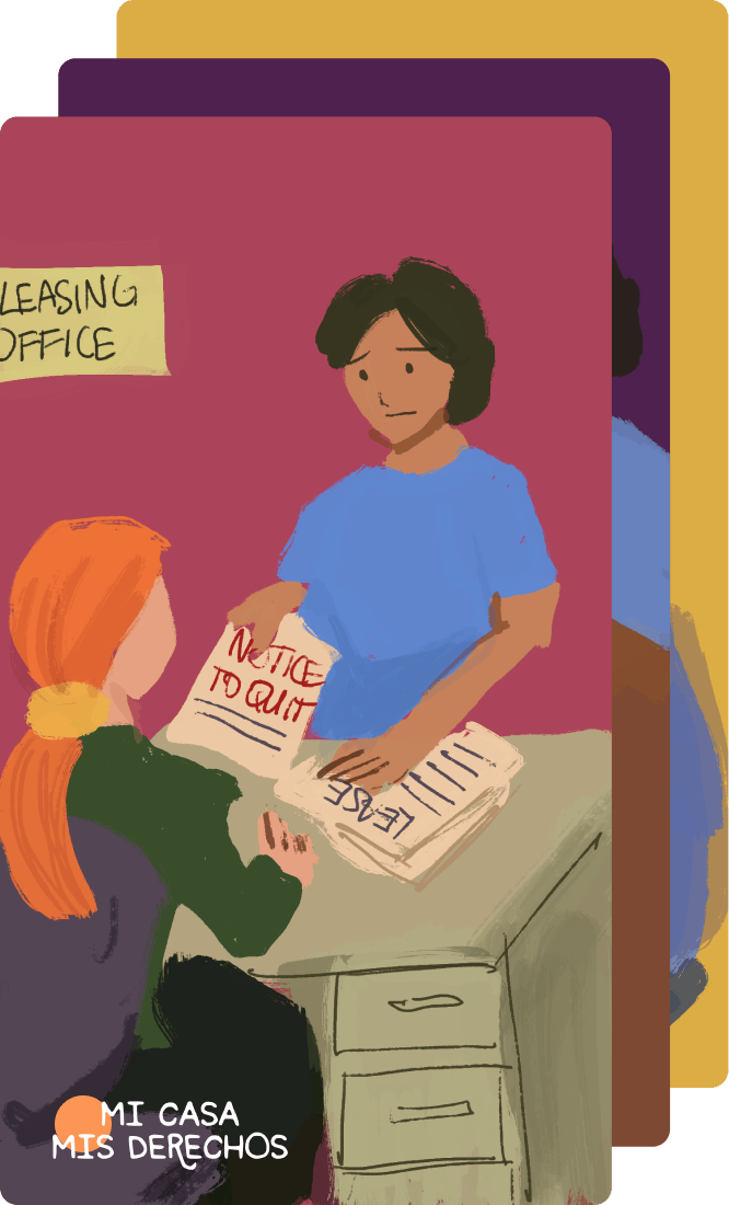
Mi Casa Mis Derechos (My House My Rights in English) is a mobile-first, Spanish language website that visually communicates tenants’ rights and resources through a series of illustrated stories.
The solution helps the user discover local resources (financial aid, legal services, etc.) and their basic tenant rights, and understand how they can take immediate action to protect themselves and their home.
The solution helps the user discover local resources (financial aid, legal services, etc.) and their basic tenant rights, and understand how they can take immediate action to protect themselves and their home.

This project was awarded the best team Master’s project in the MS HCI program at Georgia Tech.
Learn through stories
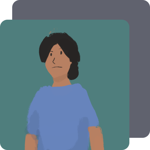
Mi Casa Mis Derechos (MCMD) teaches users what their tenants' rights are and how to exercise them by using characters and stories that they can identify with.
Find local resources
Need assistance? MCMD has a list of Atlanta organizations ready to help. The guide also indicates which organizations speak Spanish, and the right contact to reach out to.
Tap for details
MCMD uses interactive tooltips to provide in-context, plain language definitions of legal terms, as well as offer contact information to vital resources.
Link to website
You can access the website at this link.
Please note that Mi Casa Mis Derechos is still under active development, and is currently intended for mobile use!
Please note that Mi Casa Mis Derechos is still under active development, and is currently intended for mobile use!
My contribution
I was the sole developer of Mi Casa Mis Derechos, from choosing Gatsby as the development framework, to coding and deploying the website online. I played a supporting role in the UX design and user testing of the website, and wrote the technical documentation for MCMD.
Details
Research
The vast majority of the user research for this project was done in the previous semester while we were building the NoMasDesalojos website. If you are interested in that process, I recommend checking out the No More Evictions project page.
Understanding the problem
In the first semester of our work with Welcoming Atlanta, we were focused on meeting the immediate need of stopping community members who were in crisis from being illegally evicted. And while the NoMasDesalojos site is a boon in handling this, it is largely a stopgap. Our ultimate goal was to support residents in preventing an eviction notice in the first place, which means supporting them in exercising their rights as Atlanta tenants, and getting them the help they need before crisis strikes.
So, why isn’t this happening already? Here’s what we learned from our research:
So, why isn’t this happening already? Here’s what we learned from our research:
Primary issues

Info is often incomplete or conflicting
Online aid info is often inapplicable for immigrants and out of date.
Word of mouth information on assistance programs is often distrusted.
Word of mouth information on assistance programs is often distrusted.

Residents feel anxious taking action
Community members are fearful of making a mistake, and are anxious of dealing with the justice system.
Tenants also worry about backlash from landlords.
Tenants also worry about backlash from landlords.

Rights information is inaccessible
Rights info is typically written in English legalese, inaccessible to residents.
Online information websites are complex and difficult to navigate.
Online information websites are complex and difficult to navigate.
Together, these problems prevent Atlanta tenants from understanding their rights, using that knowledge to take action, or getting the assistance they need. We called this problem the information-to-action gap.
Competitive Analysis
Before jumping into the design work, we wanted a better understanding of the landscape of tools that are intended to help vulnerable folks understand their rights.
We found two types of such tools:
We found two types of such tools:
Camp 1: direct, one-size-fits-all technical resources
This camp attempts to provide general information to the public about their legal rights in specific situations, or within certain geographies. They use ample legalese and technical jargon, and are largely impersonal.
We find this camp to be largely unhelpful for Welcoming Atlanta’s community members. The explanations are dry, unrelatable, and challenging to follow if you are unfamiliar with the legal system.
We find this camp to be largely unhelpful for Welcoming Atlanta’s community members. The explanations are dry, unrelatable, and challenging to follow if you are unfamiliar with the legal system.
Example of camp 1: the Fulton County Visual Information Center videos
Camp 2: contextual, story-driven and visual tools
This camp uses storytelling and visual elements to help users break down and understand the information they need to know.
A key example that we kept coming back to for inspiration is the ACLU’s video series “We have Rights.” The narrative and visuals are not only compelling to watch, but the story helps the viewer contextualize the information into real world scenarios where they may need to use the knowledge provided.
A key example that we kept coming back to for inspiration is the ACLU’s video series “We have Rights.” The narrative and visuals are not only compelling to watch, but the story helps the viewer contextualize the information into real world scenarios where they may need to use the knowledge provided.
Example of camp 2: the ACLU’s video series “We have rights.”
We knew we wanted to create something squarely in camp 2, and pitched the idea of potentially using visual storytelling to Welcoming Atlanta. They were keen on the idea, and gave us the greenlight.
System requirements
Based on the user research data collected and analyzed in the first semester, we developed the following design criteria.
1. System should allow users to discover resources in context
2. System hould accommodate low literacy users
3. System should use stories that are authentic to users
4. System should acknowledge multiple courses of action
5. System must include clear steps on how to manage crisis
Design
With these design requirements in mind, it was time to pull out the drawing board. We workshopped ideas, hashing out design components that would satisfy the design requirements while at the same time discussing the feasibility of implementation.
At each stage of the design process, the resulting artifact — a sketch, wireframe, mockup, or prototype — was used to collect feedback. We sought feedback from the client, our advisors, and usability testing participants.
At each stage of the design process, the resulting artifact — a sketch, wireframe, mockup, or prototype — was used to collect feedback. We sought feedback from the client, our advisors, and usability testing participants.
Sketches
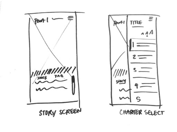
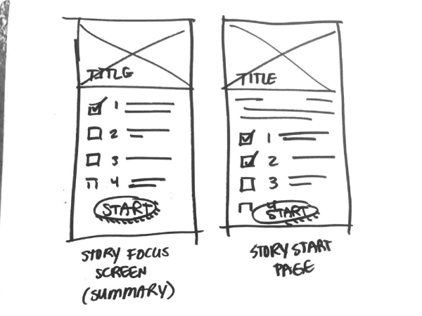
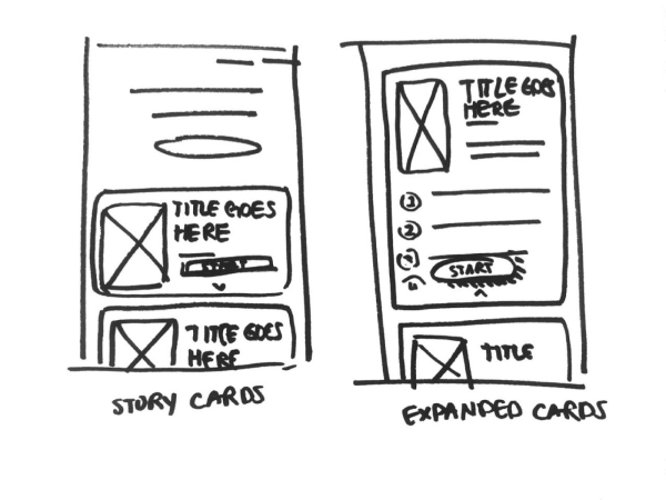
We started with rough sketches where we established design components, such as the chapter select page, story overview, and reading modes seen below.
Wireframes
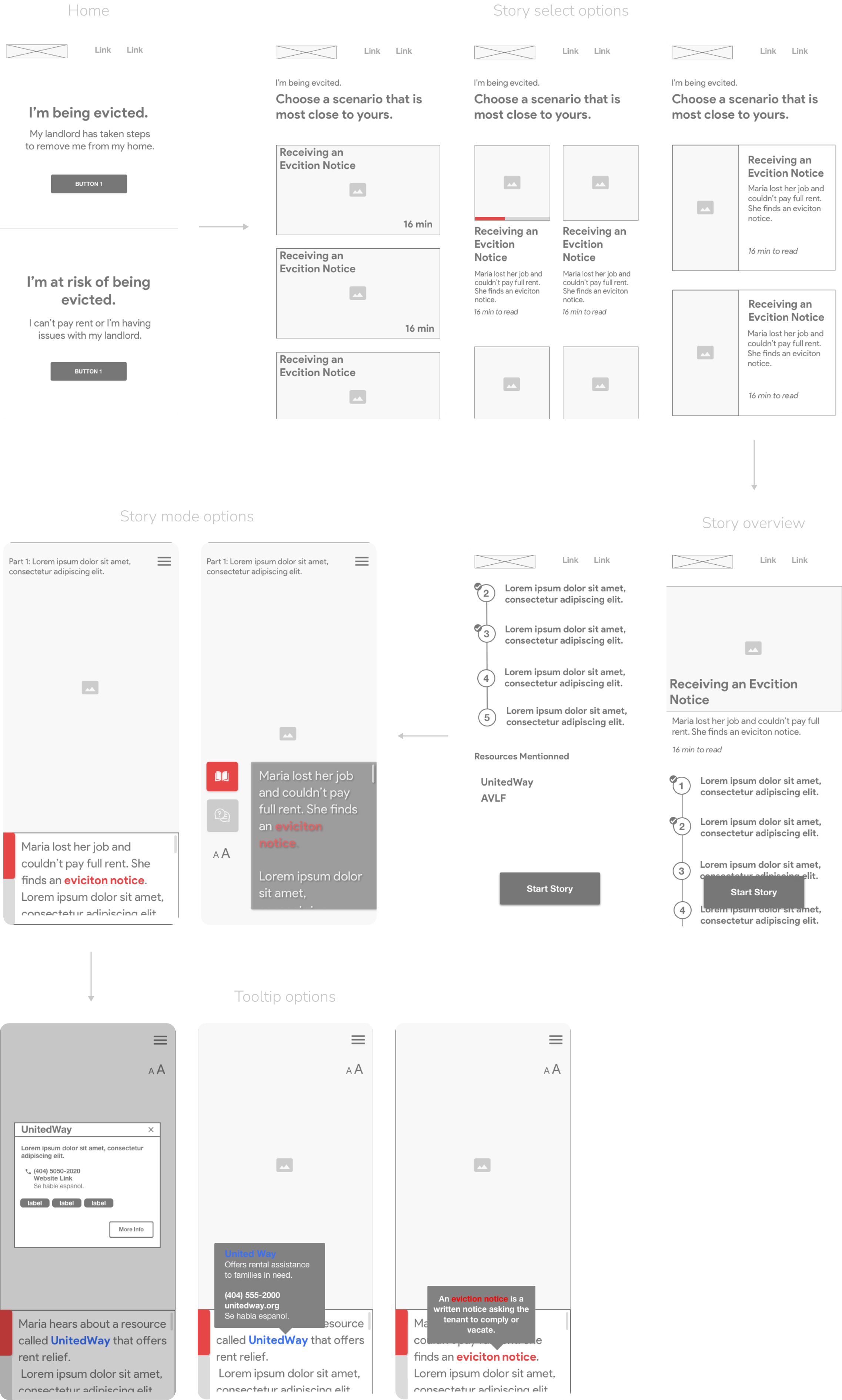
Next we translated the sketches into wireframes to establish user flow and create a blueprint for site architecture and content.
Prototype
Finally, we created an interactive Figma prototype of the site to communicate the look and feel of the final product, conduct user testing, and to dictate specs for the build.
Feel free to test out to the embedded prototype below!
Feel free to test out to the embedded prototype below!
User testing
Using the interactive prototype, we developed a formal think aloud evaluation protocol to gather data on usability and attitudes on perceived efficacy (how effective the test user thinks the solution will be in changing the behavior of the target audience).
Participants
3
Welcoming Atlanta staff

1
Volunteer

1
Community member

4
Community navigators

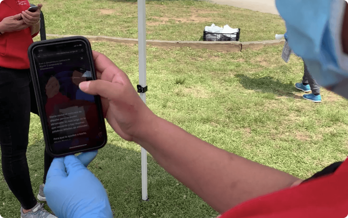
Conducting user testing with a community navigator at a Welcoming Atlanta food distribution event
Results
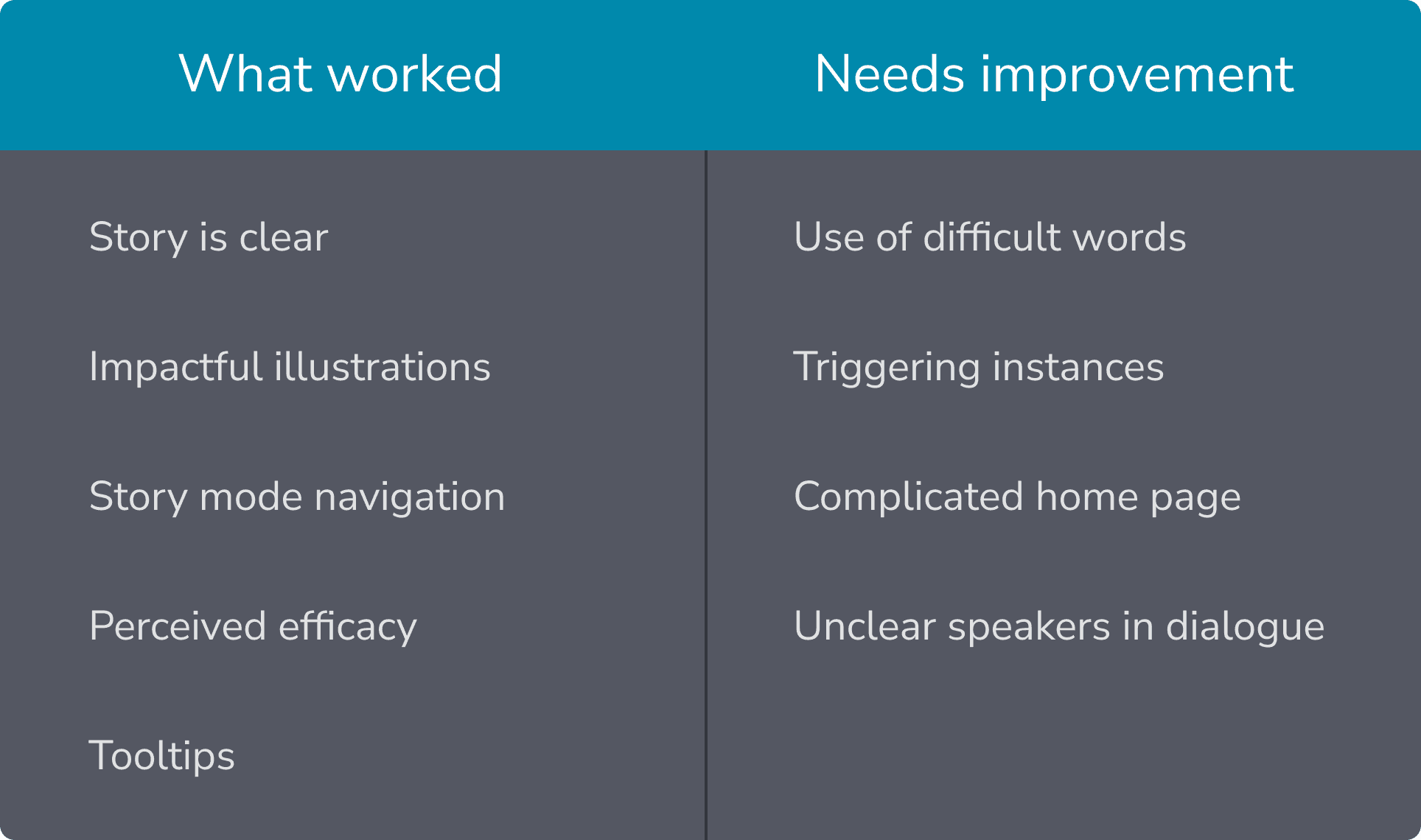
Testing was valuable in both validating our concept and revealing specific opportunities where we didn’t quite hit the mark. Some of the feedback is summarized below:
Core themes
One Community Navigator went so far as to offer the following positive feedback during our follow-up questions, and it really struck a chord with us:
“The story is really happening — it almost feels like it is happening to somebody, so this is really what is happening in real life. While reading, it feels like I was going through it myself… We know we have rights and there are organizations that can help us. But ourselves, we have to speak and communicate to learn more about our rights.”
–Community navigator
Technical implementation
For Mi Casa Mis Derechos, we decided to build it in Gatsby, a front-end framework built on top of React.
Mi Casa Mis Derechos is a static website by nature, so Gatsby, which is a static site generator with lots of optimization built in, was a natural fit. Gatsby’s load times were particularly attractive since many of our users are accessing the site from low-bandwidth mobile devices. Lastly, since I was the only developer on the team, and given the short amount of time we had, having access to a rich ecosystem like React’s was extremely helpful.
The code for this project is public on Github – you can check it out here.
If you are working on something similar or would like to otherwise chat about the implementation of the site, feel free to get in touch!

Final solution and roadmap
The website is currently under active development; however, at this time, you can access it here.
Upcoming features
Full desktop support
A second story (currently being written by the Atlanta Volunteer Lawyer Assocation)
English version