QR Cup
Closing the convenience gap between using a single-use and reusable cup at coffee shops.
Closing the convenience gap between using a single-use and reusable cup at coffee shops.
Overview
Result
Field-tested interactive
Figma prototype
Figma prototype
My role
UX designer &
researcher
researcher
The team
Ollie Hsieh, David Du,
Eileen (Huiyu) Li
Eileen (Huiyu) Li
Tools
Figma, Illustrator,
Qualtrics, Miro
Qualtrics, Miro
Timeline
Aug 2019 - Dec 2019

Problem
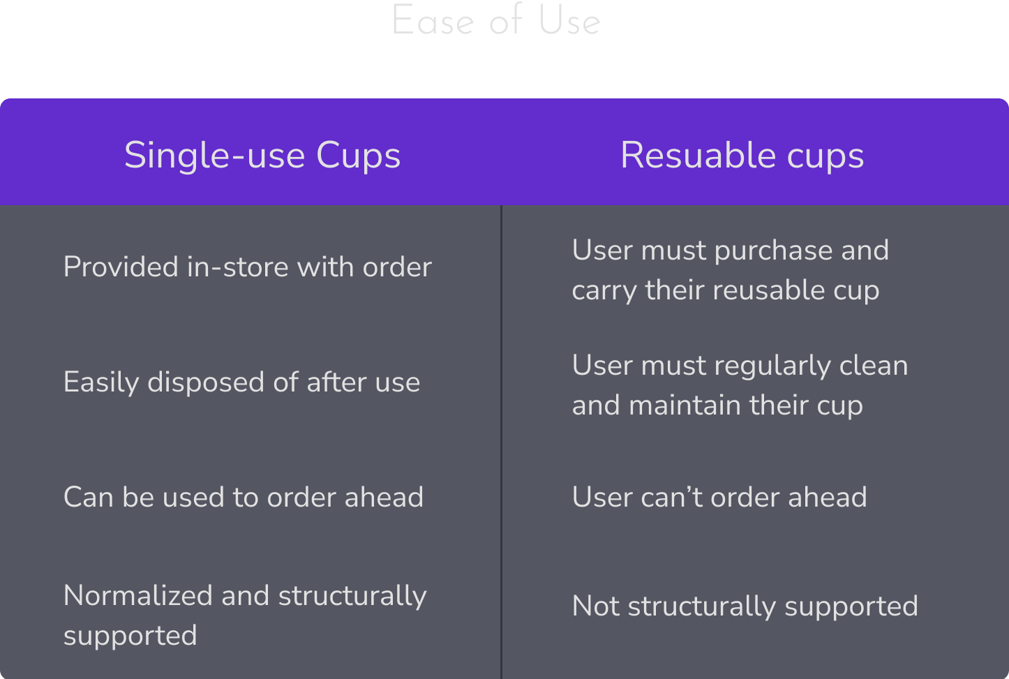
Many people order coffee with a reusable cup out of preference or a desire to avoid single-use plastics. However, ordering with a reusable cup at a coffee shop is considerably less convenient than using a single-use cup.
So, how might we close the convenience gap between using a single-use and reusable cup at coffee shops?
So, how might we close the convenience gap between using a single-use and reusable cup at coffee shops?
Solution
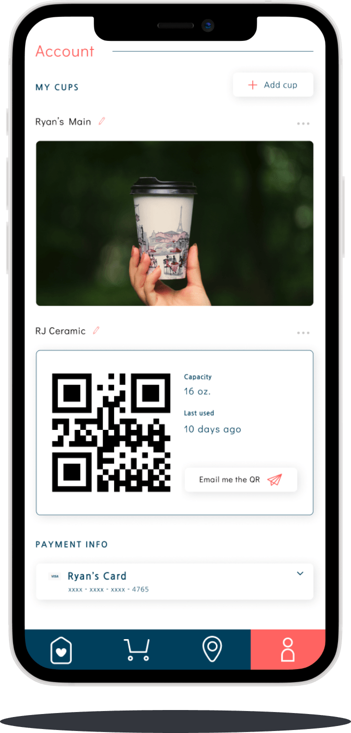
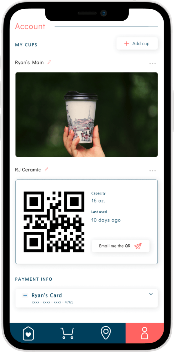
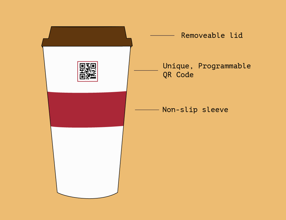
We designed QR Cup, an app that allows users to order and pay automatically with their reusable cups at nearby coffee shops via a QR code.
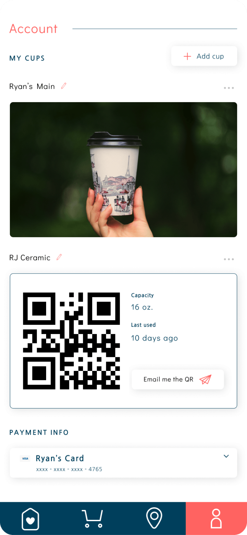
Users print out a QR code linked to the app and place it on their reusable cup. When ordering at a cafe, users simply present their mug to the barista, who scans the QR code to obtain their order and payment details.
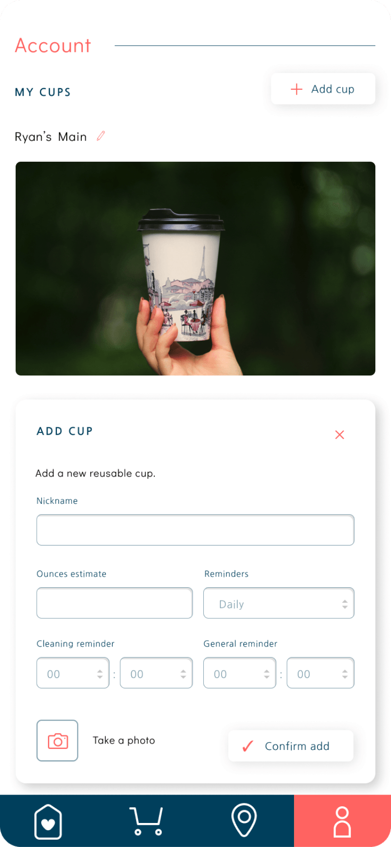
The app also tracks usage of the cup and allows the user to set regular reminders for packing and cleaning their cup to reduce cognitive load.
Let your cup do the talking
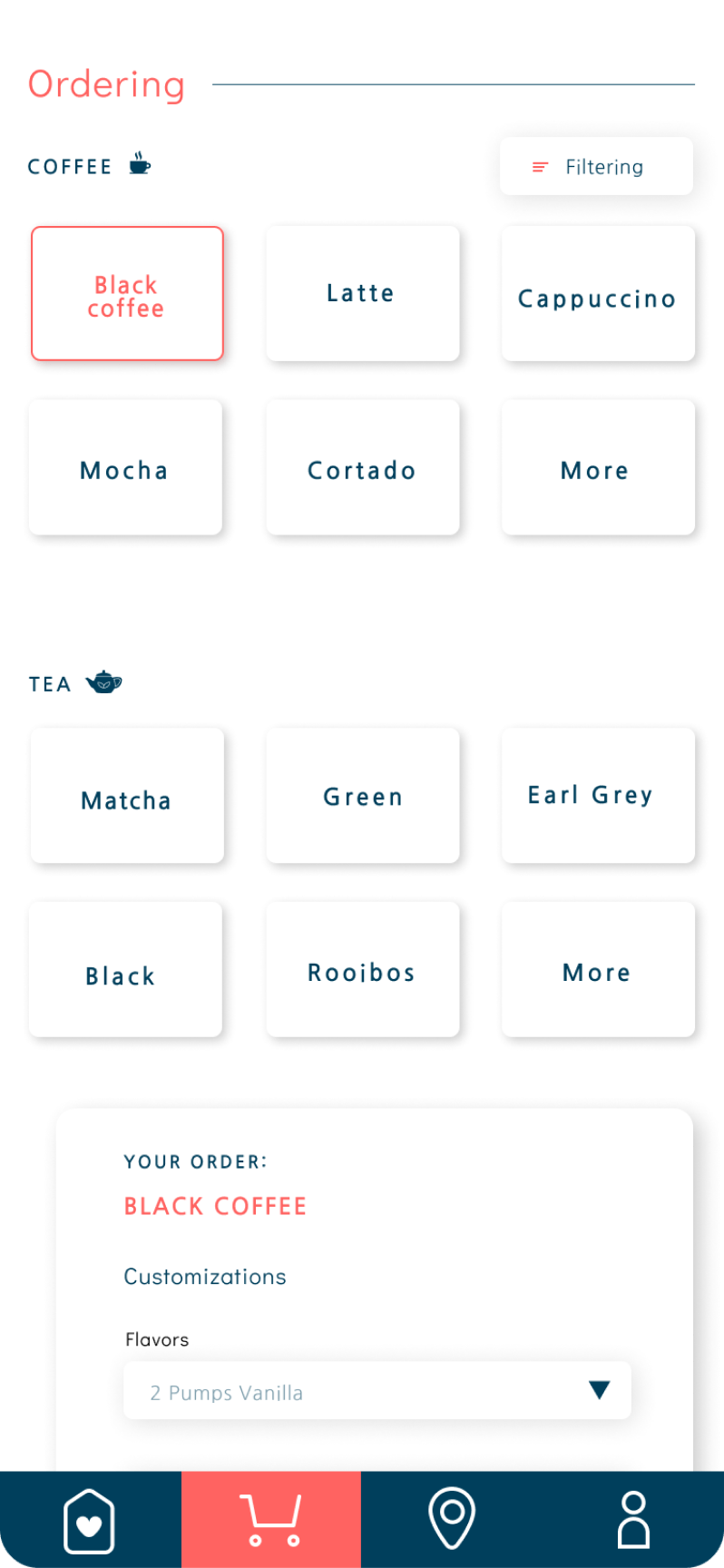
QR Cup completely automates the ordering process, providing the barista with both your order and payment information through a printable QR code. It also translates the capacity of your thermos into the store's corresponding size.
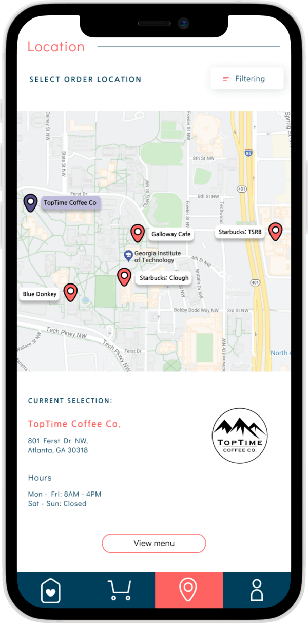
Quickly find nearby cafes
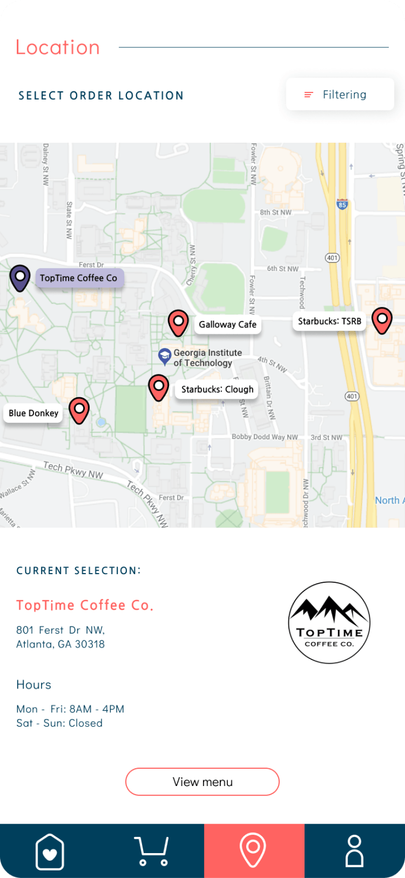
Need your caffeine fix in a hurry? QR Cup takes the guess work out of locating the coffee shop nearest to you. It also provides critical information like business hours and addresses.
Track your impact
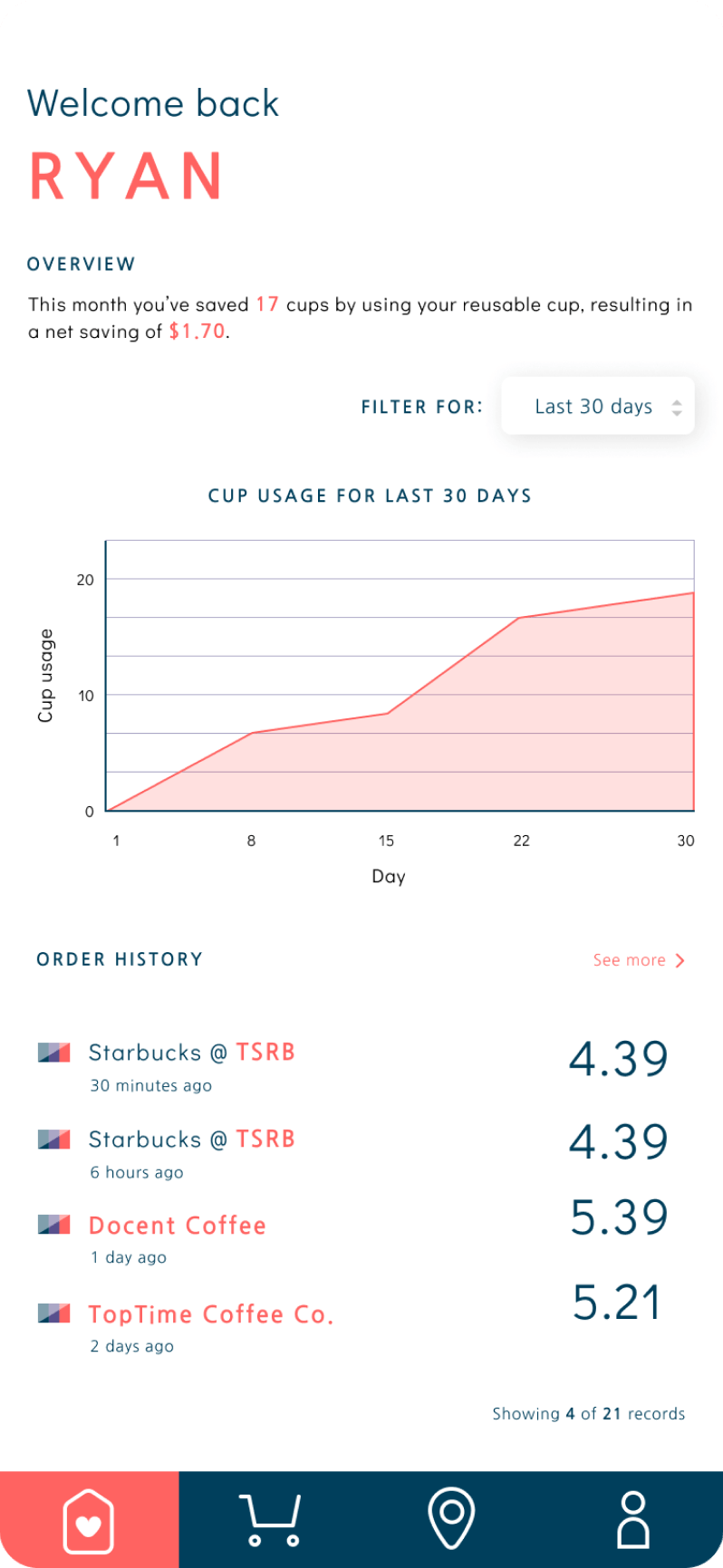
Curious about how many single-use cups you've avoided? Or just how many times you ordered coffee this week? QR Cup automatically tracks and visualizes usage, savings from reusable cup discounts, and your environmental impact.
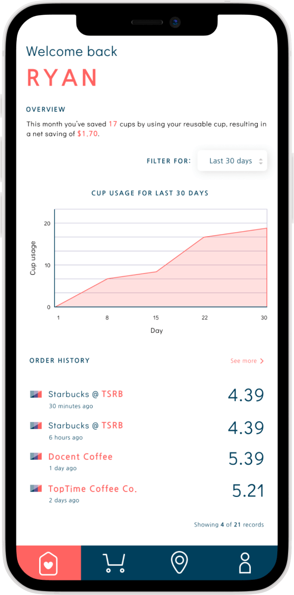
My contribution
With the other designer on the team, I was responsible for building and designing the app's prototypes from early sketches to wireframes to the final product. I created the design's initial user flow, storyboard, and mockups. Since the project's completion, I have also made some refinements to the prototype on my own.
On the research side, I helped develop and distribute online surveys, led user-testing sessions and heuristic evaluations, and distilled our findings into clear, actionable design plans.
On the research side, I helped develop and distribute online surveys, led user-testing sessions and heuristic evaluations, and distilled our findings into clear, actionable design plans.

Process
Understanding the problem
To better understand the depth of the problem and the obstacles reusable cup users were facing, we started with two generative research methods: field observation and surveys.
Field observations
Online research, such as Starbucks' annual social impact report, confirmed that people overwhelmingly choose to forgo reusable cups. However, we wanted an up-close look at peoples' behavior while ordering, how frequently they chose to use reusable cups (plus what kind), and how ordering systems differed across shops. We teamed up in pairs to observe customers at popular local cafes for sessions lasting about an hour.
Locations visited

Key takeaways
Only about 7% of all customers ordered with reusable cups
A significant portion of customers carried a reusable cup, but did not order with them
A large share of customers took time-saving measures (ordered ahead, used an app to order/ pay)
Surveys
The observational data was useful in confirming our initial research hypotheses around reusable cup use, but we were lacking real data from users. To remedy this and help frame further research, we developed a Qualtrics survey that asked questions like:
How often do you visit coffee shops (Starbucks, Peet's, etc.)?
If you do use a reusable cup when ordering at a coffee shop, why?
What are some of the challenges you face in carrying and using your reusable cup?
If you do use a reusable cup when ordering at a coffee shop, why?
What are some of the challenges you face in carrying and using your reusable cup?
Results
1
The most cited obstacles were: "It's inconvenient to pack a personal cup" and "I'm not sure if I can use my personal cup at coffee shops"
2
Participants said that they ordered with reusable cups to save money, eliminate waste, and out of preference
3
More than 50% of participants said that reducing single-use plastics is very or extremely important to them
4
While the majority of respondents owned a reusable cup, only 5% said they said they ordered coffee with them
Scoping down
With a stronger grasp on the common pain points users were having, we felt confident that we could proceed with meaningful in-depth interviews with reusable cup owners.
Semi-structured interviews
We conducted 5 semi-structured interviews with folks who own reusable cups to learn more about their motivations, drill down into their anxieties about ordering with them, and discuss features they might want to see in a new product. Conversations lasted 45 minutes - 1 hour, and took place around midtown Atlanta.
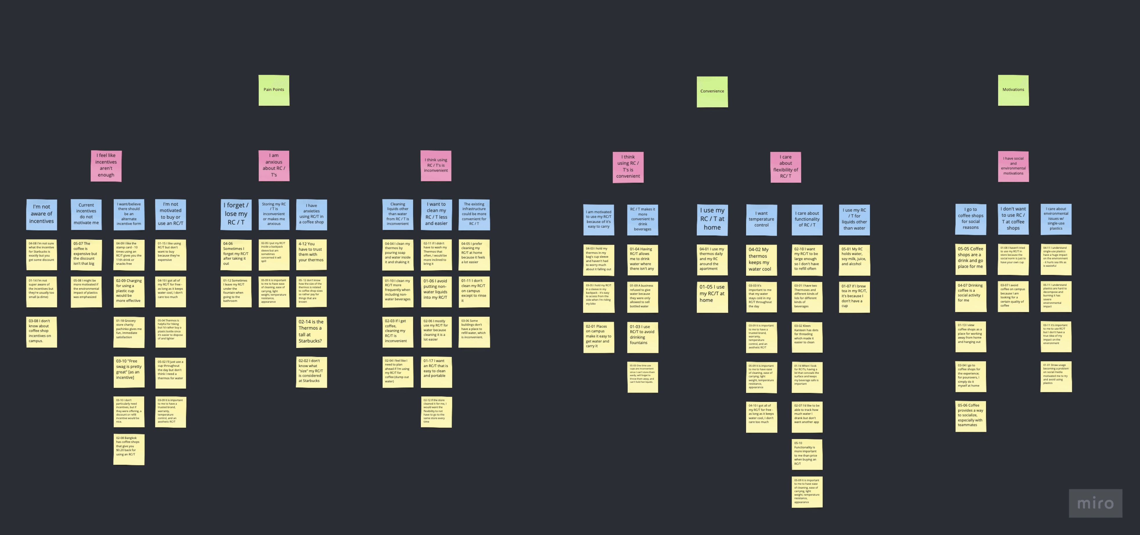
Affinity map
After all interviews were complete, we set down as a team and constructed an affinity diagram (above) to distill common themes across participants.
Findings
1
Users sometimes forget their reusable cup at home or lose it while out
2
Users find storing their reusable cup inconvenient and stressful
3
Users are anxious about ordering with their reusable cup because they don't know what size to tell the barista
4
Users felt cleaning their reusable cup after use is inconvenient
5
Participants felt like there was not enough incentive to use a reusable cup
6
Participants generally felt motivated to decrease their use of single-use plastics
Brainstorming and ideation
With our initial research complete, we sketched out design implications from our research findings and brainstormed possible design solutions as a group. The focus was on generating as many creative solutions as possible -- without judgment on their quality. We then sorted design solutions under different umbrellas, discussed potential pros and cons, sought evidence from research, and finally ranked them.
The result was two robust ideas that we wanted to explore further.
The result was two robust ideas that we wanted to explore further.
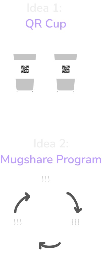
QR Cup
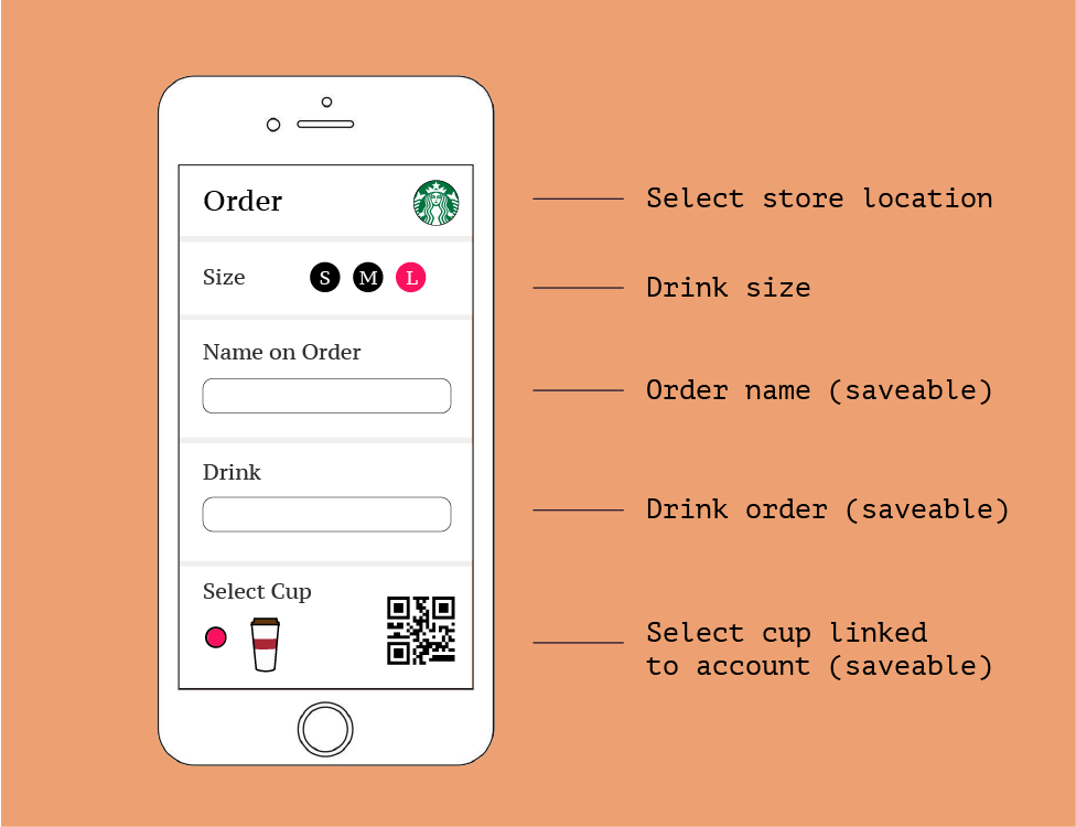
This concept allows users to order and pay automatically with their reusable cup at coffee shops via a QR code. The user would download an app on their phone, enter their drink of choice, personal information, and payment details, then be able to automate the checkout process at cafes. The app would also include reminders to pack and clean their cup, and track their usage so they can better understand their savings and environmental impact.
Initial concept
Mugshare program
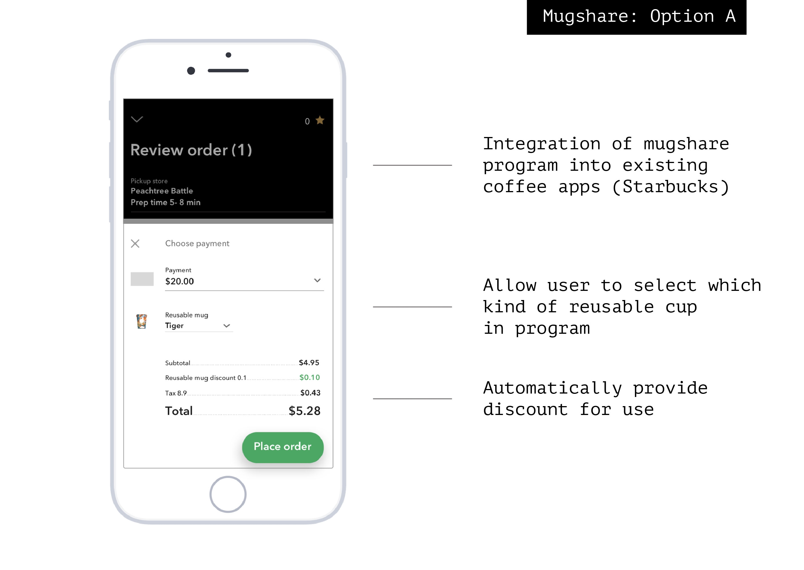
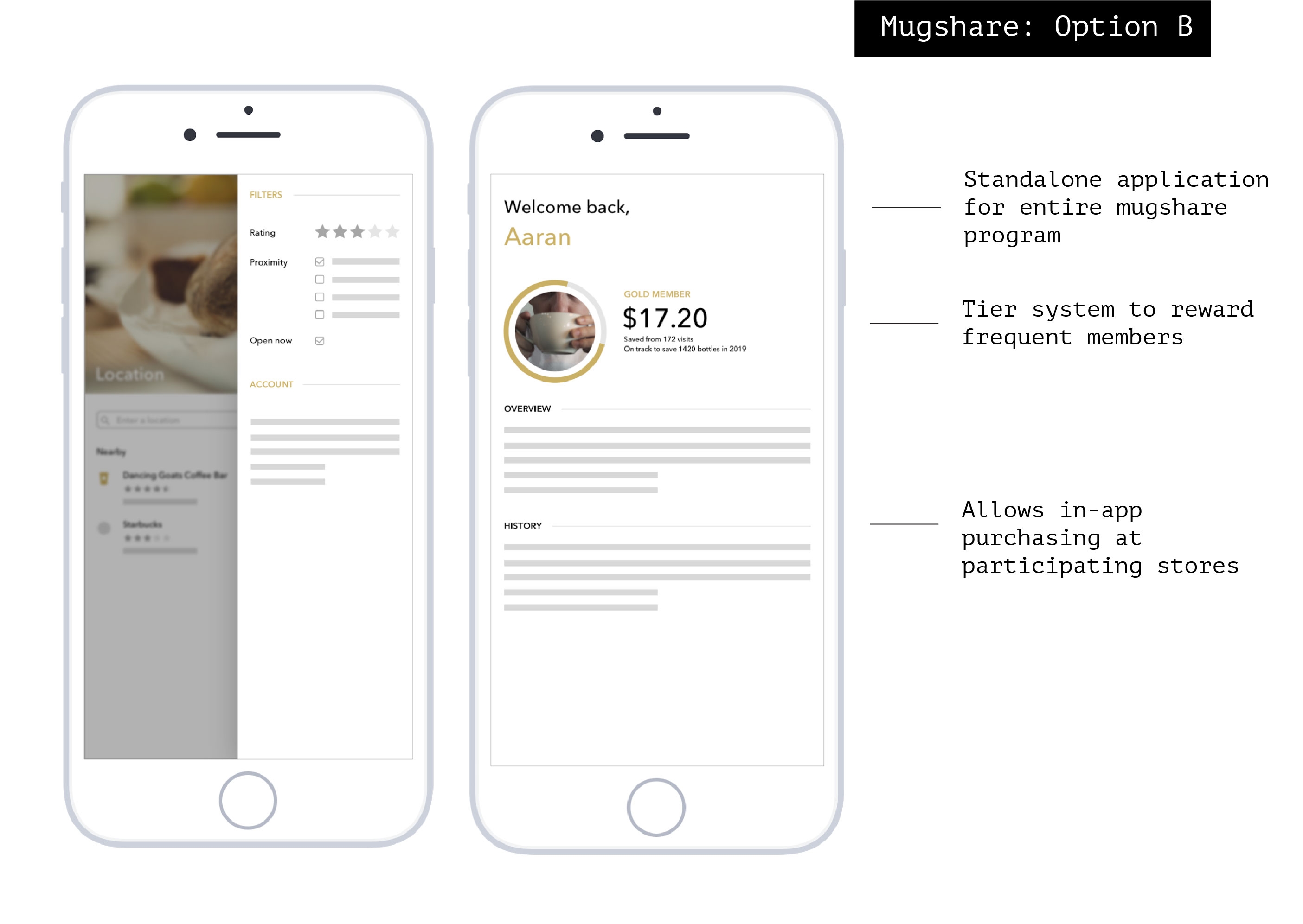
A mugshare program is a cup exchange system wherein local cafes provide reusable cups for drink orders (as well as incentives for using them), and allow users to return the mugs at any of the participating stores. The system typically entails a deposit to prevent theft and offloads responsibility of washing cups to the venues.
For this concept, we were interested in designing the mobile app that would allow users to quickly and easily rent out and return cups in the mugshare program. We had two versions of this idea that we wanted to explore: (A) allowing users to select and return mugs through existing cafe apps and (B) a completely new, standalone application that would manage a mugshare program that cafes could to opt into.
For this concept, we were interested in designing the mobile app that would allow users to quickly and easily rent out and return cups in the mugshare program. We had two versions of this idea that we wanted to explore: (A) allowing users to select and return mugs through existing cafe apps and (B) a completely new, standalone application that would manage a mugshare program that cafes could to opt into.
Initial concept
Finalizing the idea
With two feasible ideas on the table, we were now left with the task of choosing one and fleshing it out into something we could fully prototype.
Selecting a winner
To gather high-level feedback, we presented our project ideas to other MS Human Computer Interaction students as well as faculty. We had the students and faculty rate the designs on three criteria: feasibility, novelty, and how much it solves the problem. Idea 1 (the QR Cup) took first place in feasibility and novelty, while idea 2 (mugshare program) slightly edged out the QR Cup for first in how well it solved the problem.
With this feedback in hand, we then conducted an internal review of the two deisgns, rating each on the same criteria. After some internal discussion and further review of the research we had condcted, we chose to advance the QR Cup. While we all agreed that the mugshare program may have a larger impact due to its scale, implementing it within the scope of this project would have been difficult -- hinging on cooperation from coffee shops. On the other hand, the QR Cup design was incredibly feasible, more novel than a mugshare program (which are rare, but exist), and still solves critical problems revealed through our research.
With this feedback in hand, we then conducted an internal review of the two deisgns, rating each on the same criteria. After some internal discussion and further review of the research we had condcted, we chose to advance the QR Cup. While we all agreed that the mugshare program may have a larger impact due to its scale, implementing it within the scope of this project would have been difficult -- hinging on cooperation from coffee shops. On the other hand, the QR Cup design was incredibly feasible, more novel than a mugshare program (which are rare, but exist), and still solves critical problems revealed through our research.

Crystalizing the concept
Before beginning work on the QR Cup prototype, we wanted to fully flesh out the concept and create a shared understanding of what the user experience should look like. To do so, we locked in the app's core features (and justified them against research).
Core features and justification
1. Automated ordering
Expediency while ordering was key with the users we talked to in interviews and observed. Whether they are running to class or need to meet a deadline, users want to be able to order their coffee and exit the cafe in short order. Allowing users to order and pay automatically is simply faster.
Further, the largest reason users cited for avoided using a reusable cup in our survey was a lack of convenience. Enabling a user's cup to pay and order for them directly boosts their convenience, putting them more on par with ordering via a mobile app in advance.
Further, the largest reason users cited for avoided using a reusable cup in our survey was a lack of convenience. Enabling a user's cup to pay and order for them directly boosts their convenience, putting them more on par with ordering via a mobile app in advance.
2. SMS reminders
A large pain point across the user interviews was the forgetfulness of users to clean or pack their thermos for the day. Allowing the users to set dedicated reminders for themselves in the app reduces their cognitive load, placing it instead on the phone.
3. Auto size conversion
Several interview participants and survey respondents said that they felt anxious about ordering with a reusable cup due to a lack of knowledge of what size their thermos would be at the cafe. Automatically converting their thermos size to the venue they select allows them to be confident that their drink will be the appropriate size.
4. Usage tracking
Users noted that they want to reduce single-use plastics but often don’t feel motivated to do so. By visualizing the amount of cups they have avoided using, users can better see their environmental impact. Survey respondents indicated that a large motivation for using a reusable cup was to save money from incentives, so we wanted to track and visualize that data as well.
5. Printable QR code
Multiple interviewees noted that they easily lose or damage their reusable cups. An easily printable QR code allows users to retrofit their existing thermos without spending virtually any money, and if lost or damaged can be easily replaced.
Prototype
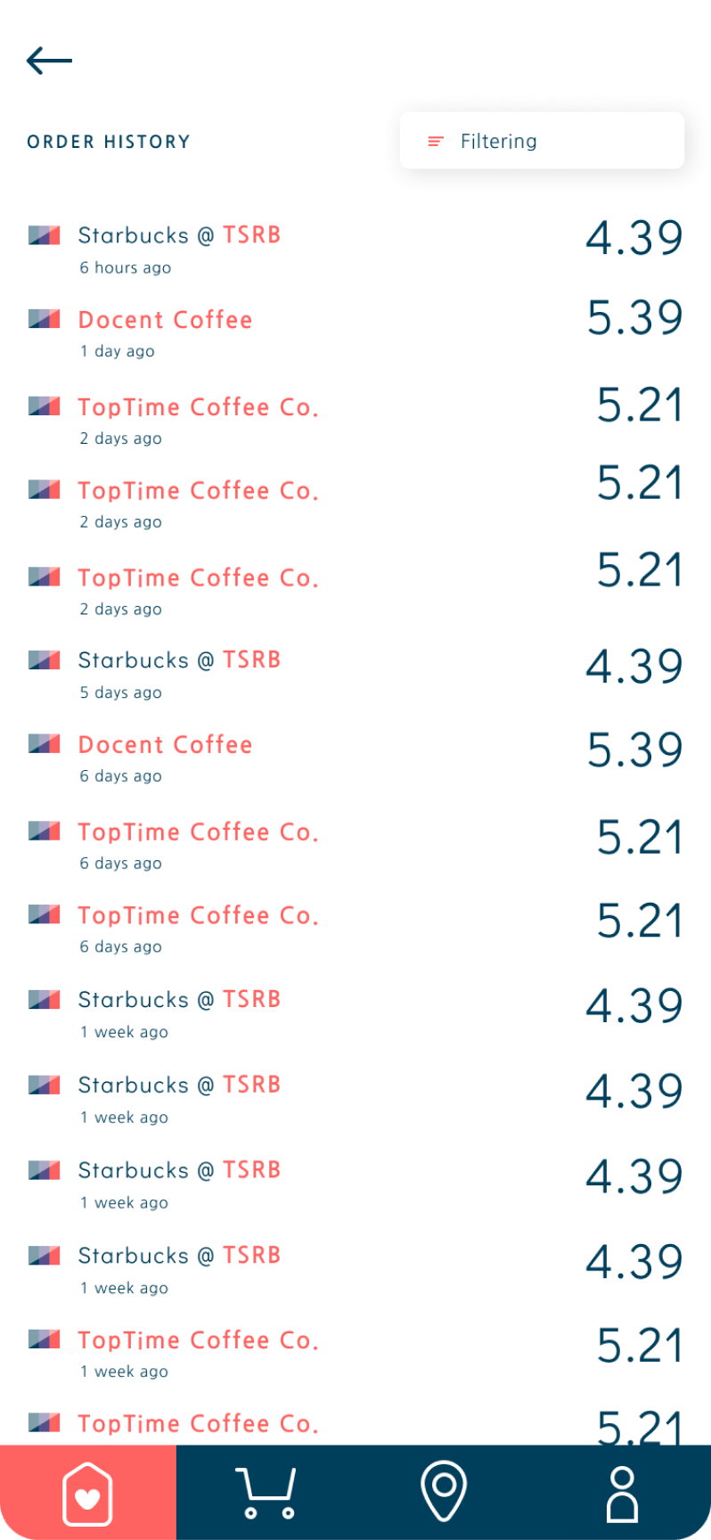
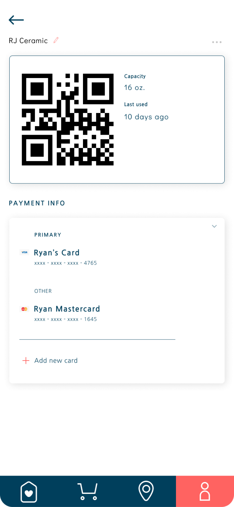
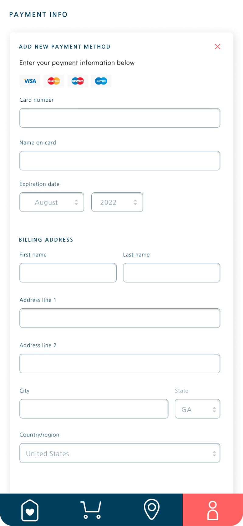
To collaboratively construct a testable prototype of the mobile application, we decided to build the system in Figma. Figma allowed us to both create high-fidelity mockups of the QR Cup application and build in interaction (clicking, swiping) that we could test with users. For the QR code, we used an online QR code generator that we can customize and program to point to a dummy address, and printed off a test QR code to simulate scanning it on a reusable cup.
Testing and iteration
To gather feedback and identify areas of improvement for our prototype, we conducted both expert and user-based testing. I find this pair of testing to be complementary: expert-based testing allowed us to identify usability issues according to recognized usability specifications and best practices, while user-based testing permitted us to assess how well actual users are able to complete tasks important to them and obtain feedback in their voice.
Expert-based testing
We conducted 3 heuristic evaluations with experts in the UX field, asking each participant to assess the prototype based on Shneiderman’s Eight Golden Rules of interface design. Each session began with an overview of the eight golden rules as well as the prototype, and lasted in total from 60 - 90 minutes; participants were encouraged to think aloud as they went through the evaluation.
The heuristic evaluations uncovered glaring problems with wayfinding in the prototype, which we worked to address before moving on to user testing to avoid getting repetitive feedback.
The heuristic evaluations uncovered glaring problems with wayfinding in the prototype, which we worked to address before moving on to user testing to avoid getting repetitive feedback.
User-based testing
We recruited four students at Georgia Tech to participate in usability testing of the prototype. To test the design, we developed six benchmark tasks for each participant to attempt, and asked them to rate each task after completion using a NASA TLX form. Since wayfinding was an issue identified in our heuristic evaluations, we also tracked the amount of time spent on each screen during tasks, as well as the number of screens navigated to. With this data, we used Smith's formula to calculate objective lostness.
Results
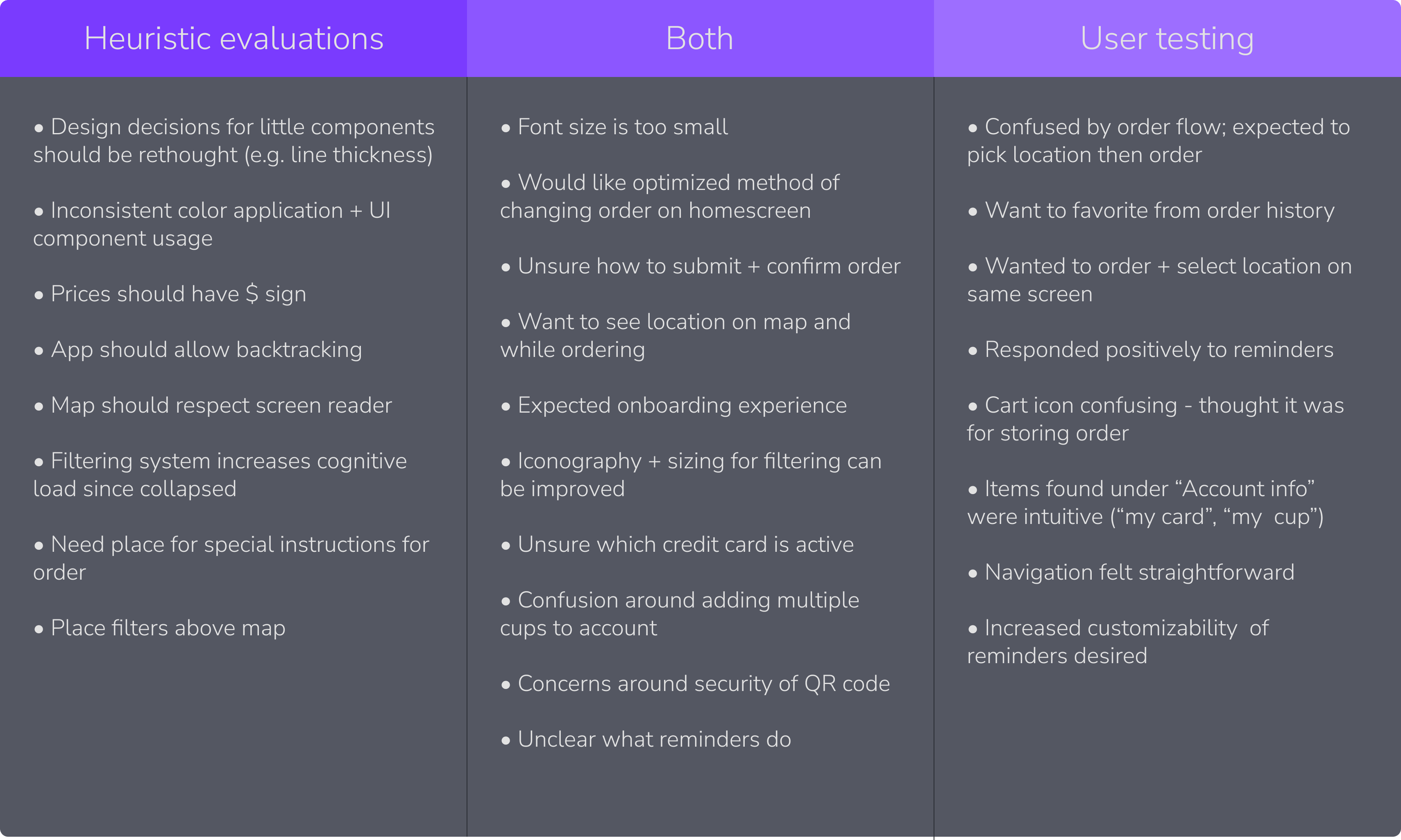
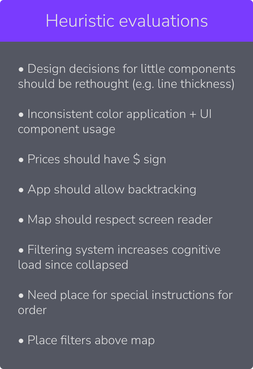
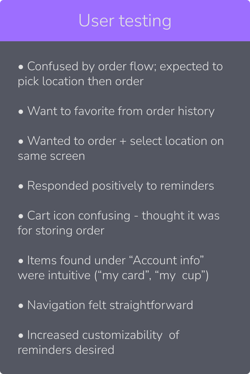
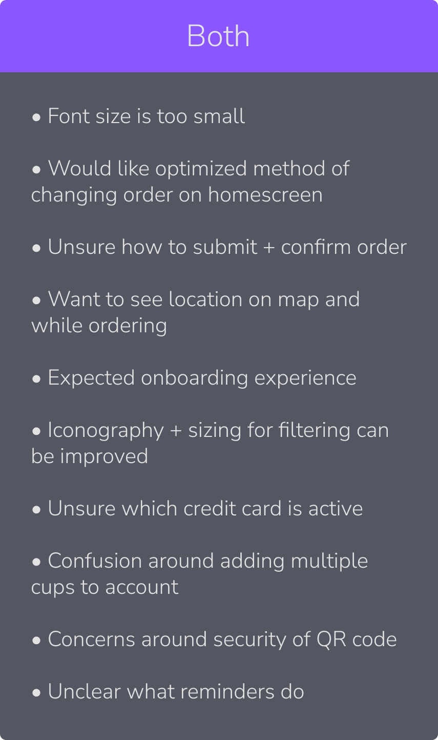
To analyze the data, we gathered as a team and coded our notes for emerging usability themes. Through rigorous internal discussion, we then distilled these into actionable research findings, grouping items based on whether they were identified by experts, users, or both.
Key findings
Prototype improvements
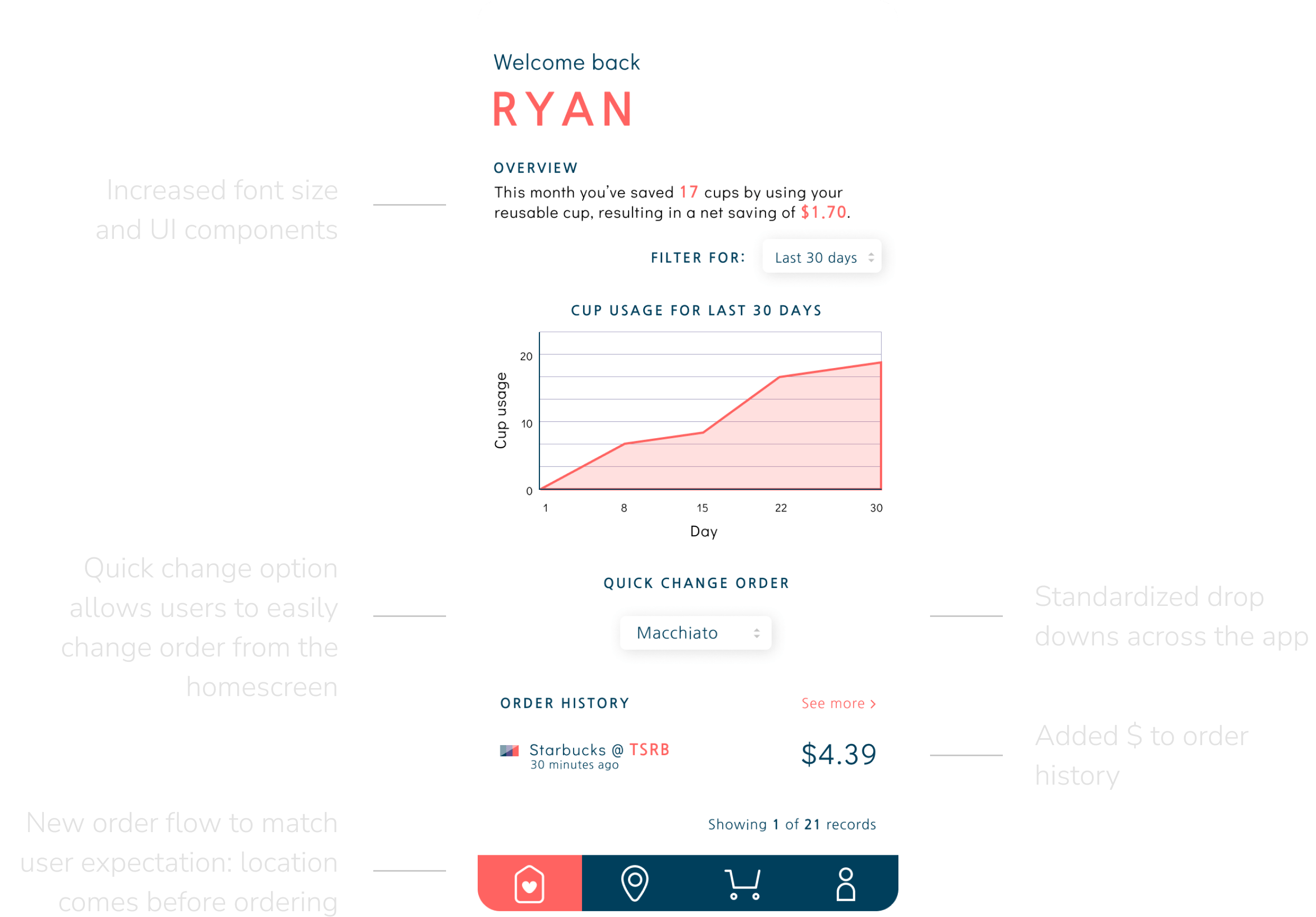
Increased font size and UI components
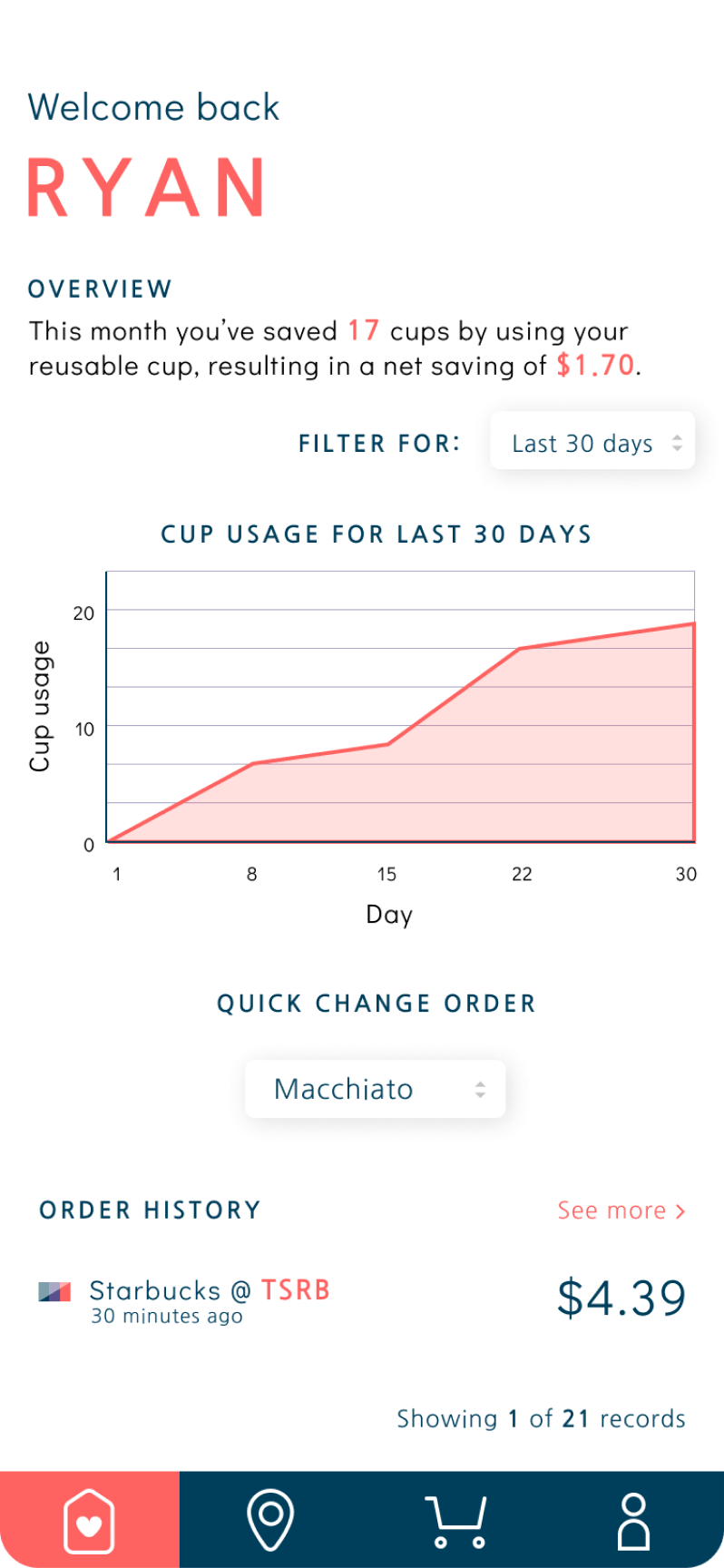
Quick change option allows users to easily change order from the homescreen
New order flow to match user expectation: location comes before ordering
Standardized drop downs across the app
Added $ to order history
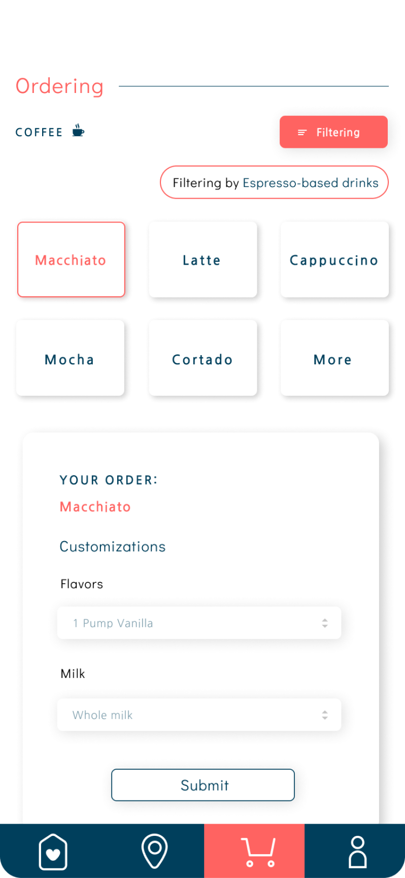
Filtering icon red when feature in use; displays current filtering selection
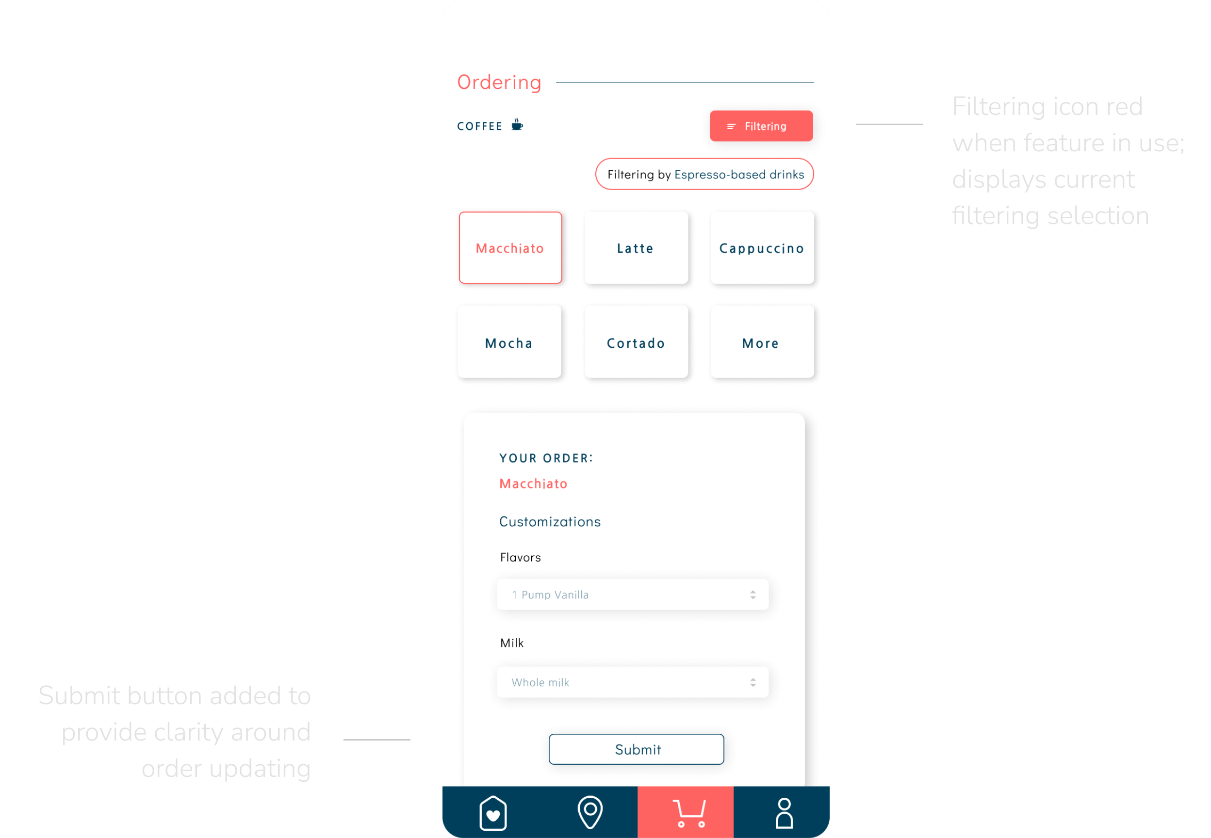
Submit button added to provide clarity around order updating
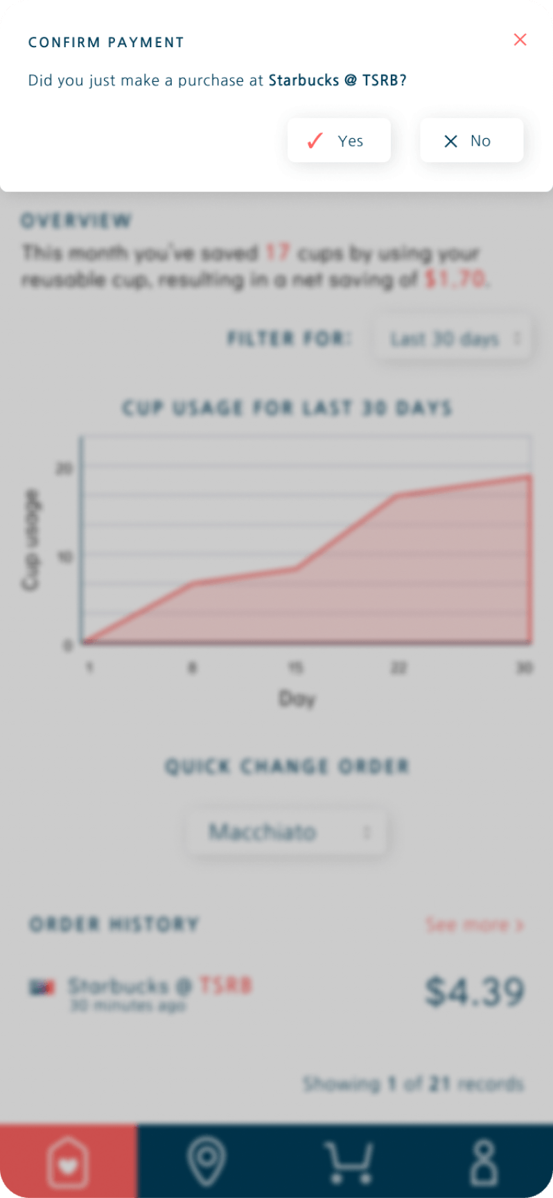
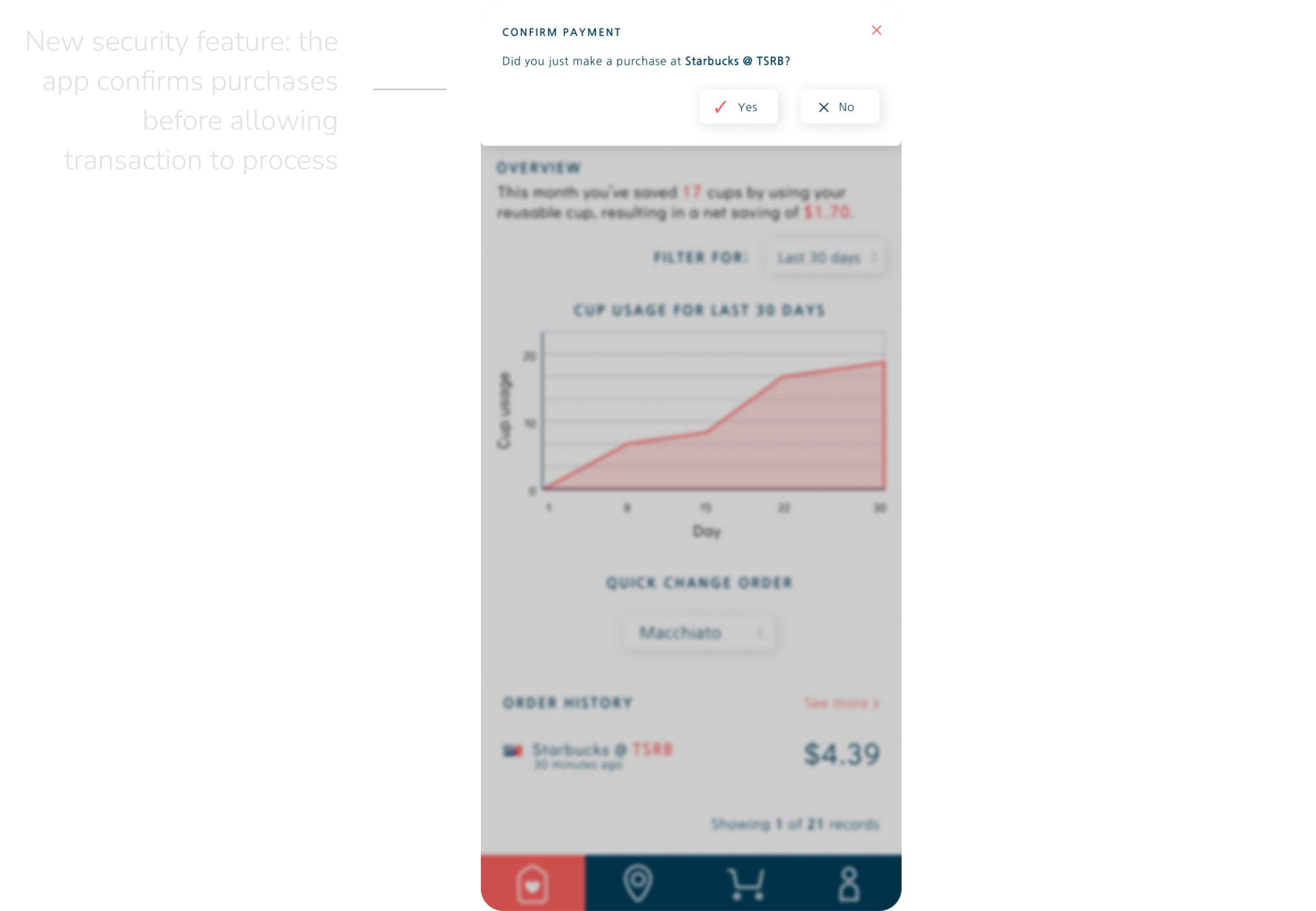
New security feature: the app confirms purchases before allowing transaction to process
Reflection
I had a blast working on this project! Our team had a strong mix of folks with experience in design, research, and development – which went a long way in improving the quality of the work.
Something that really worked for us was our project management; we had daily standups during the semester that allowed us to identify roadblocks, ask questions, and check in on progress. We also used basecamp to share files, create to-dos, and directly collaborate on work, which I found highly effective.
This project also made me interrogate the limits of technology in addressing a user's problems – and how to be creative to get around those limitations. Many of the users we spoke to in our research flagged issues that were material in nature: inconvenience cleaning and carrying their reusable cup, a lack of infrastructure to clean their reusable cups in public, etc. As a team, we wanted to address these problems with our design in a way that was not artificially using tech when other simpler solutions could be more effective. As a result, we identified the areas of these problems that we knew we could be effective at addressing, most notably the cognitive load of the user. That's why we added automatic reminders for carrying and cleaning the cup as a core feature of QR Cup.
